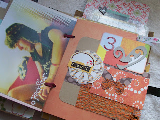
This is the first page opposite a picture of the park. I used Sassafrass Lass papers and stickers, the bird is part of Tim Holtz sizzix die and the tape is one from Leonora's kits.
This is a hideous picture of my friend Luke, what a twinkle. But he does love the horrible ones, says he feels less boring.!!!!!
Each picture os followed by a collaged page made up of a 4 x 4 card piece in kraft decorated with papers, stickers, ribbon etc. I used these Maya Road labels instead of transparencies as I didnt have any and wrote behind them. I can read through them but sorry u cant as the writin isnt clear enough via the computer.
Another photo and collage page, this time I used my Martha Stewart butterfly punch and the heart from a Tim Holtz die.
I think this page of the carousel is one of my faves. We used spray ink, paper, cut out stars, twine and a punched border and hanging piece. By the way I did write an 'e' in between the s and l to spell carousel correctly.
I also love how this page turned out with the pink from the roses and the gems, stickers and papers.
This cool bow was so simple and clever. Cut a piece of vintage lace and tie another piece of thin ribbon around the middle to make a bow shape,..............cool.
This was Tref playing on his ipod, I like the colours and the papers.
This is the inside back pages which I might add something else to, but at the mo I'm sleeping on it.


absolutely gorgeous Jo! lots of hard work but it has really paid off x
ReplyDeletethat is fantastic I must have a look at the class I downloaded from that site had totally forgotten about it. Thanks for the lovely comment you left on my blog will definitely be keeping an eye on the scrapping weekend and thanks for offeirng to be my friend!!
ReplyDeleteJo, I love this! Gorgeous work :-)
ReplyDeleteThis is just so good Jo!
ReplyDeleteMost lovely...
ReplyDeleteI love how your mini came together. Such a nice assortment, but it still feels unified.
ReplyDeleteRinda
Looks lovely,Jo
ReplyDelete